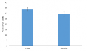
A bar graph presents count data for a categorical predictor variable. The bars allow us to visualize the relative counts in the respective groups within the categorical predictor. The name of the category is the label for the corresponding bar within the graph.
Example 1
During the Christmas Bird Count, volunteers go out to collect count data on bird species detected in a particular area. This example looks at counts of bird species detected in each of several locations within Delaware.

Excel Directions
Video Directions:
Data File
Example 2
Amherst College students were interested in whether the number of spots was associated with sex in the yellow-spotted salamanders (Ambystoma maculatum) that migrate through tunnels under Henry Street each year to breed in vernal pools (seasonal wetlands). Students collaborated with graduate student Megan Casser, who worked with Professor Scott D. Jackson at the University of Massachusetts, to collect data on salamanders passing through the tunnels. They collected 14 males and 6 females and compared the number of spots.
