Box plots are another way of displaying data. Box plots allow you to compare a numeric response variable across groups. They allow us to see the spread of the data, by making use of divisions within the data. Recall that the median divides the data in half. In a box plot, the line across the center indicates the median of the full data set (it might be a dot in some software). Next, the median for the observations in the upper half of the data set is computed; this value called the third quartile, denotes the top of the box. The median for the observations in the lower half of the data set is computed (first quartile) and defines the bottom of the box. The brackets show the typical range of data observed and are referred to as whiskers. Some observations may be outside the range of other values collected; these are referred to as outliers and are represented by the dots (or sometimes stars) in the graph. Software has internal algorithms to determine outliers.
Example
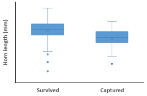
Horned lizards (Phrynosoma mcalli) are named for the spikes on the head. Scientists were interested in whether the horns prevent the lizards from being eaten. One of the main predators is a bird called the loggerhead shrike (Lanis ludovicianus) which skewers its prey on thorns or barbed wire. This small bird does not have the talons of large predatory birds, so skewering the prey provides a means for this bird to consume its prey. Young et al. 2004 found the remains of skewered lizards and compared the horn length to living lizards. This example is an excerpt from Young et al. 2004 in Whitlock and Shluter 2009.
In the graph, you can observe the range of values obtained by the researchers by looking at the brackets. In Excel, the median is represented by the line, the mean is represented by the x. Note that there are a few outliers for both the surviving individuals and the captured individuals.
Excel Directions
Video Instructions:
Data File