A frequency histogram may be used to visualize and understand patterns in the data. Data is binned into specific size ranges and then displayed in bars. We may look at bins within categorical groups or bins as comprising a range of numeric values. The y-axis indicates the frequency or count within each of these groups/bins.
Example
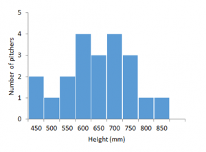
The example below is a subset of data from a study exploring patterns of growth of California pitcher plants (Darlingtonia californica) in response to various environmental predictors, including nutrient availability (Ellison and Farnsworth 2005). Measurements refer to the pitcher (pitcher height, pitcher mouth diameter, and pitcher tube diameter), though we are just focused on pitcher height here. Though grouped into bins, the groups on the x-axis are numeric. The y-axis indicates the frequency of organisms in that group.
Excel Directions
Video Directions:
Data File