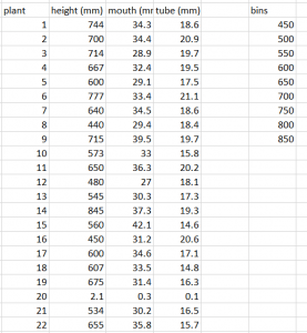
- Your first step in constructing a histogram is to determine what bins might be appropriate for the data. The range of height of the pitchers is 440-845 for this example. So, in this case, counting by 1 or 10 would not be appropriate, as it would be difficult to display all of the data. Here, we will bin by 50’s. List your bins in a column on your Excel sheet. (Other software is capable of determining bin sizes automatically or by user input, and bin size can affect the graph greatly, so really think about what is reasonable).
2. If you have not installed the data analysis toolpak, follow the directions to do so. Click on the Data tab. Click on “Data Analysis”. Select “Histogram” and then click OK.
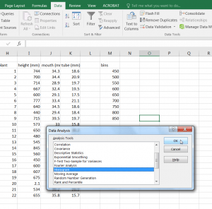
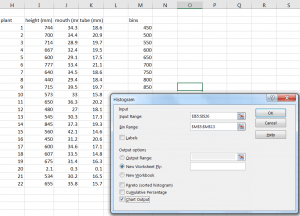
3. Click the space beside “Input Range”. Then highlight your data; here this is all the cells containing height of pitchers. Then, click in the space beside “Bin Range”. Finally, put a check in the box beside “Chart Output”.
4. Your output should look like the following. You will have a list of bins and the frequency of observations for each bin.
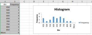
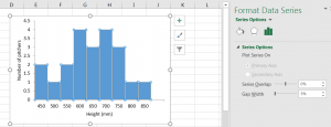
5. Now, you will want to work to fix the formatting. First, delete the “More” row from the table. Then, delete the legend. Delete the title and rename the axes. Click on the graph. Click on the bars in the graph. The Format Chart menu comes up on the right. Click on the bars option at the top. Then, under series options, set Gap width to 5 percent.
6. Format following formatting for all graphs.
Multiple Series
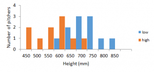
- Sometimes you may want to look at two series at once. Say, for the example above that some samples were collected at low elevation and others were at high elevation. Organize your data into a table and pick bins as you did above.
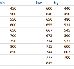
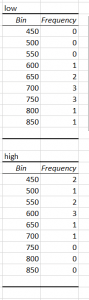
2. Follow the directions above to obtain the table with bins and frequency for each series of data.
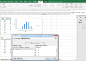
3. Delete one of the graphs, but keep the other. Click on the remaining graph and make sure you are on the “Design Tab”. Click on “Select Data” at the top right.
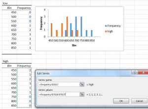
4. Click “Add”. An Edit series window will pop up and you will select the name of the series and then highlight the values under the frequency column of your second table. Click okay.
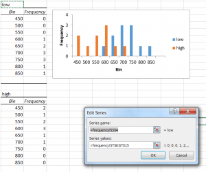
5. The Select Data Source window will appear again. Click on the original series and then click “Edit Series”. Replace the Series name with an appropriate title. Click “OK”. This will bring you back to the Select Data Source window. Click “OK” again.
6. Format following formatting for all graphs.