A scatter plot shows how a numeric response variable changes with different values of a numeric predictor variable. Each point on the graph represents an observation in the data. Trend lines may be fitted to the data to help discern patterns.
Example 1
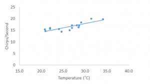
In this example, a scientist was interested in how temperature might influence the number of chirps per second of the striped ground cricket (Pierce 1948). Because crickets are ectothermic (internal temperature depends on external temperature), one might anticipate that they would be less active and hence chirp less at lower temperatures. In this graph, we can see each observation on the graph and can see a general increase in chirps per second as temperature increases.
Excel Directions
Data File
Example 2
We are interested in whether winter temperature influences the survival of gall flies in goldrenrod galls in Massachusetts. Before looking for this relationship, we want to graph winter temperature over time to see if there is variation. This time, we are also interested in including a measure of variation around the mean.
Excel Directions
Data File