Let’s briefly take a look at this test in other software to see differences in the output. Here is how the data would be entered into R and the test run. We can check that the observed table looks to be the same. R (and other software) likes alphabetical order for categories, so it might reorder the levels. We run the test with a single command. By default, R uses a continuity correction, so we set that option to FALSE to obtain the same output obtained with Excel.
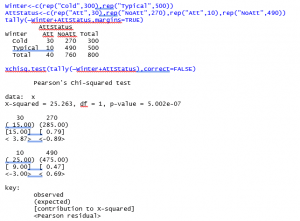
In this output, the expected counts as shown in parentheses under the observed counts. The test statistic and P-value are in the top row.
To identify differences, using the R output, you can do more than with the Excel output. Look at the Pearson residuals – values larger than 2 in absolute value indicate the cell demonstrates a difference.